


 LinkBack URL
 About LinkBacks


Creo este post con la intención de dar algo de luz en el tema 4K/UHD recopilando la información de internet.
1. ¿Qué son exactamente 4K y UHD?
4K es sinónimo de "4000" de la resolución de pantalla de 2160 * 4096 píxeles, y es el nuevo estándar definido por la industria del cine. La velocidad de fotogramas es todavía 24 fps, y la profundidad de bits sigue siendo de 8 bits.
UHD es sinónimo de Ultra Alta Definición y cuenta con el apoyo de las industrias de radiodifusión y televisión. Se diferencia de 4K, con su mayor profundidad de color de 10 o 12 bits (que supone un aumento enorme de la gama dinámica de colores). La relación de aspecto es llevado de nuevo a la relación de la TV 16/9 por lo que laresolución es de 2160 * 3860.
La velocidad de cuadro es todavía un gran debate. Algunas emisoras argumentan que se necesitan 120 fps para el fútbol y que la profundidad de color debe ser de 12 bits.
La especificación de la UIT da un rango de valores, pero la industria necesita llegar a un acuerdo rápidamente y se depositan en algunas cifras para que la interoperabilidad puede ser garantizada.
La compañía de Thierry Harmonic cree que 4K con 10 bits de profundidad de color @ 60 fps es un "buen momento de salida al mercado y un buen compromiso de costos".
Fuente
2. Deberá / deberían fusionarse 4K y UHD?
No, el cine flujo de trabajo se mantendrá por separado. Las emisoras no aceptarán tan bajas tasas de frecuencia de refresco de su propia producción.
3. ¿Cuál es el beneficio de 4K?
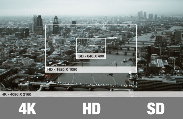
El principal beneficio es mejor calidad de imagen. La mayor resolución de 4K significa que hay 8 millones de píxeles en pantalla en comparación con los 2 millones de píxeles en una pantalla de 1080p. Si pensabas 1080p HD ya era fuerte y detallado, 4K puede ser incluso más, porque los píxeles son cuatro veces más pequeño. Esto es en parte por qué 4K Ultra HD ha sido pensado para pantallas de mayor tamaño - los píxeles adicionales tienen un impacto mayor en una gran pantalla.
Tener más píxeles en la pantalla no sólo significa una mejor imagen en las pantallas más grandes, mayor densidad de píxeles también hace que sea difícil ver los píxeles individuales cuando se sienta muy cerca del televisor. Puede parecer extraño, pero que esencialmente significa que usted puede sentarse más cerca de la pantalla, incluso si es más grande que el 1080p que tiene ahora sin notar los píxeles.
4. ¿Qué marco de tiempo se necesitará para su adopción?
Todavía no hay un estándar aunque se espera que salga en lo que queda de año. Ya ha comenzado la venta de televisores con esta tecnología que se espera aumente paulatinamente para establecerse una producción en masa para 2015. La Copa Mundial de Fútbol de Brasil en 2014 mostrará un pico de interés, pero es demasiado pronto para un verdadero impacto. Los Juegos Olímpicos de 2016 serán el comienzo de la adopción masiva.
5. "HD ready" o 720p precedió al "Full HD" o 1080p. ¿Veremos algo parecido aquí?
Parece que el logotipo UHD estará debidamente protegido, por lo que los consumidores no deberían tener confusiones. Los servicios como Netflix se centrará en formatos intermedios, pero los principales radiodifusores probablemente harán una transición directamente de HD a UHD.
6. ¿Existen obstáculos a corto plazo?
Si. El actual HDMI 1.4 sólo acepta 4K a 30 fps. Se espera que en breve se estandarice una nueva conexión HDMI 2.0 que llegue a los 60fps.
Por otra parte la HD necesita de un ancho de banda de transmisión de 6 MPS, mientras que la UHD requerirá probablemente de 20 MPS para la transmisión a 60 fps y 10 bits de profundidad de color. Por lo que se requiere de nuevo hardware bastante potente. Al mismo tiempo para que los costes sean menores se requiere de un nuevo estándar de compresión, el cual ya está perfilado bajo el nombre de H.265 o HEVC(High Efficiency Video Coding).
De momento tampoco hay un estándar de TDT-UHD.
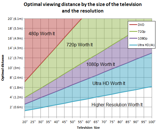
7. En general, ¿cuál es la nueva distancia de visualización óptima?
La siguiente figura muestra el tamaño de la pantalla en función de la distancia de visión para diferentes resoluciones.
De forma más simple, significa que con una pantalla de 50 tienes que situarte a 1,5 metros de la pantalla o necesitas una pantalla de 85 y situarte a 3 metros para sentir realmente el efecto 4K.
Según la industria del sector, para apreciar el incremento de resolución que la Ultra Alta Definición nos ofrece, deberíamos disponer de una pantalla de Tv de 50 o más, cifra que de solo escucharla nos puede hacer palidecer pensando en el tamaño del salón de nuestra casa pero no es así, es más bien al contrario. Imaginemos esa pantalla de 50 sobre la que estamos viendo una señal HD (1920×1080) a unos 2,2m -que es la distancia mínima que los expertos recomiendan para ese tipo de pantalla-. A esa distancia la pantalla ocupará una buena parte de nuestro ángulo de visión, concretamente unos 30°, proporcionándonos una adecuada sensación de inmersión en la imagen. Si de repente ponemos en el Tv una señal con resolución SD (720×576) deberemos dar varios pasos atrás para conseguir verla sin que la falta de definición nos resulte muy molesta, con lo que nuestro ángulo de visión se reducirá considerablemente, y con él la sensación de inmersión en la imagen.
Por el contrario, si nuestro televisor de 50 tiene una flamante pantalla con resolución UHD, la distancia mínima de visionado se reduce a 1,2m sin que apreciemos pérdida alguna de definición gracias a la mayor densidad de píxeles; así nuestro ángulo de visión pasa a ser mucho mayor (unos 55°) y con él la sensación de inmersión, que alcanza límites similares a los que experimentamos cuando nos sentamos en las butacas buenas del cine.
La teoría dice que un correcta sensación de inmersión empezaría en el entorno de los 30° y alcanzaría la saturación al superar los 100°, así que todavía hay margen para aumentar la resolución y seguir acercándonos a la pantalla más allá incluso de la UHDTV.
Este gráfico quizá ayude a entender mejor la idea.
8. ¿Quedará obsoleto el 4k?
8K (UHD2 Ultra HD2) llegará con una resolución de 7680 x 4320 (o 4320 p), esto es cuatro veces la resolución de 4K y 16 veces la de 1080p. Puede parecer abrumador de entender, pero es una tecnología que ya existe, y los fabricantes han dado a entender que la producción podría comenzar en tan sólo cuatro años. Esto plantea una pregunta sobre la viabilidad a largo plazo del 4K, ya que puede llegar a ser un trampolín para 8K, al igual que 720p fue superado rápidamente por 1080p después de un corto período de tiempo. La televisión nacional de Japón, NHK , ha estado presionando por el 8K. La BBC lanzó una buena parte de los Juegos Olímpicos de 2012 en Londres en 8K el año pasado.
Dicho esto Los problemas de HDMI y ancho de banda tendrían que ser resueltos para manejarlo. Si es así, entonces no está fuera la posibilidad de que nos íbamos a actualizar a 8K en cinco años, pero es demasiado pronto para decir con certeza en este momento.
9. Y del contenido 4k ¿Qué?
No hay mucho para elegir en este momento, pero las ruedas parecen estar en marcha. Ya hay un par de canales que emiten en 4K en Europa y Corea del Sur, mientras que la BBC en el Reino Unido ya está planeando para ventilar algunos documentales en esa resolución.
Habrá servicios en internet de contenidos 4k en streaming. Netflix ya se está preparando para ello, también Sony está preparando su servicio 4K y cuenta además con un un dispositivo Sony FMP-X1 que es un reproductor multimedia con forma de disco que viene precargado con 10 verdaderas películas 4K y clips cortos. Los consumidores podrán descargar más directamente a través de un servicio remunerado de Sony que se lanzará en el otoño. Teniendo en cuenta que una película 4K puede ser de 100 GB de tamaño, el ancho de banda podría llegar a ser un problema aquí, también.
Sony y Panasonic también han anunciado que están investigando en un nuevo disco de capacidad de 300 Gb que probablemente estará preparado para 2015 y que probablemente será los que sustituirán a los actuales Blurays.
10. ¿Cómo será el reescalado de contenidos?
Casi todos los televisores ultra alta definición 4K, así como selectos receptores y reproductores de Blu-ray son capaces de escalamiento 4K. Upscaling crea nuevos píxeles de una imagen a través de información de los píxeles cercanos y duplicarlo. Los más píxeles que tienen que ser añadido, el mayor potencial existe para los errores.
Al trabajar con una buena fuente, upscaling general funciona bien. Sólo recuerde que incluso escalado a una resolución de 4K no será transformar una imagen de mala calidad en una de gran calidad. Así, mientras que un disco Blu-ray upscaled se ven muy bien en un televisor 4K, una cinta VHS upscaled no se ve tan bien. Las mejores imágenes de ultra alta definición vendrán de fuentes de vídeo 4K nativos, pero el contenido de 1080p y 720p podrán tener una buena visión, lo que no se logrará con el SD.
Vease en este artículo como Sony está trabajando en el reescalado de películas antiguas a 4K.


 Citar
Citar